It has struck again. Covers being changed mid-series.
Revealed today was the final book in Stephanie Perkins' quasi-series, Isla and the Happily Ever After. I don't mind the covers of Anna and the French Kiss and Lola and the Boy Next Door. Though they are a little cheesy for the story content really, they are cute too.
But this outbreak of changing covers mid-series has actually made me nervous and not excited for second and third books in series. I never know when a publishing house is going to release a cover but it be completely different for the most ridiculous reasons. The one I hate most is "We feel like this cover worked better with the story"....really?
When a book is being released in paperback from previously being hardback, I get it. That actually makes sense. Especially if the book has taken a dip in sales the new cover will hopefully catch another group of readers eye. But when the second or third book is released in hardback with different covers, well frankly, it sucks.
The majority of book lovers I know want their series to match. Even if you don't really care about that, it would be nice to have matching covers so that everyone can tell that books are a part of a series.
In this economy I cannot afford to by all the new covers to make sure my series matches. So now they are going to have a different look, and probably be a different size as well.
Anna and the French Kiss
Lola and the Boy Next Door by Stephanie Perkins
Isla and the Happily Ever After


Nightshade by Andrea Cremer
Shatter Me by Tahereh Mafi
Blood Red Road by Moira Young


Revealed today was the final book in Stephanie Perkins' quasi-series, Isla and the Happily Ever After. I don't mind the covers of Anna and the French Kiss and Lola and the Boy Next Door. Though they are a little cheesy for the story content really, they are cute too.
But this outbreak of changing covers mid-series has actually made me nervous and not excited for second and third books in series. I never know when a publishing house is going to release a cover but it be completely different for the most ridiculous reasons. The one I hate most is "We feel like this cover worked better with the story"....really?
When a book is being released in paperback from previously being hardback, I get it. That actually makes sense. Especially if the book has taken a dip in sales the new cover will hopefully catch another group of readers eye. But when the second or third book is released in hardback with different covers, well frankly, it sucks.
The majority of book lovers I know want their series to match. Even if you don't really care about that, it would be nice to have matching covers so that everyone can tell that books are a part of a series.
In this economy I cannot afford to by all the new covers to make sure my series matches. So now they are going to have a different look, and probably be a different size as well.
Anna and the French Kiss
Lola and the Boy Next Door by Stephanie Perkins
Isla and the Happily Ever After


I actually really like the new covers. The bottom two are the new paperback and I probably would have bought them to go along with my hardcovers on my shelf. What I hate is that my hardcovers won't match!
When Stephanie Perkins came to ATBF11 I was soo excited to meet her and get her to sign my Anna and Lola books and I was hoping when Isla was released to see her again so that she could sign that one. Of course, that will still happen...but still.
Nightshade by Andrea Cremer
This is the cover change that made me so super mad. I LOVED the original covers. They stood out on shelves, they were different. The original Wolfsbane cover never even actually made it to shelves. They released it, then changed it before it went to print.
Shatter Me by Tahereh Mafi
I have the original Shatter Me sitting on my shelf still waiting to be read, so I don't know how much the new covers really go with the story, but this is one change that I am actually okay with.
I hate that it still happened in the middle of the series, but I like the new ones so much better. In a sea of pretty girls in pretty dresses on YA covers, the eyes stand out. JUST DO IT THAT WAY FIRST.
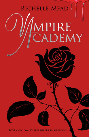
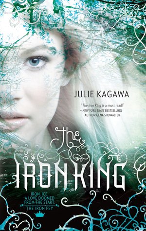
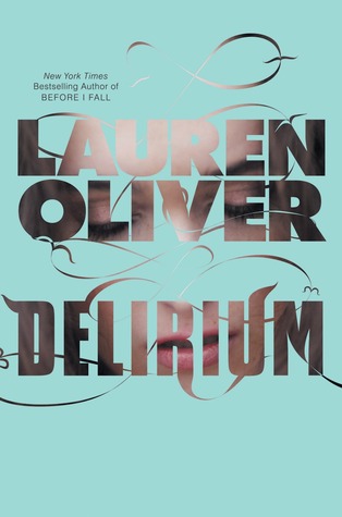
Another set of new covers that just blends with all the others. The original is so interesting. It just begs the question "where is she going?". The colors on the new ones are eye catching...but the cover models don't stand out or do anything to make me want to read the story.


Sure the new covers are cool. They don't have some girl in some flouncy dress but they don't really catch your eye. The originals scream WE TAKE PLACE IN OUTER SPACE! WE HAVE ROMANCE! WE ARE AWESOME!
Why change that?

Another pretty girl on the cover....okay...so I know the original has a girl too...but at least the script was interesting.

Original is creepy. The outline of the ghostly Jack the Ripper is awesome. New cover....meh. If it didn't have Maureen Johnson's name on it, I probably wouldn't even pick it up.


Another set of covers changed right in the middle of the series. The originals are so neat and actually look relevant to the story. The new ones are cool, but don't give me any hint as to what the story might be about and in a sea of dark covers there is nothing on them that stand out.
So since this seems to be an epidemic I think I've decided I am not going to be YA series in hardback anymore until all the stories in the series are released so that I am not trying to get my covers to match. I'll just wait and buy them in paperback, or buy them used so I don't feel like I've spent too much money on books the publishers have no problem changing at the drop of a hat.
What series cover has changed that really bugged you?
Do cover changes even matter to you?
How do you deal with it?
How do you deal with it?


